
VID Extension Kit
Author: Henrik Mikael Kristensen
Version: 0.0.1
Date: 29-Aug-2009
Contents:
IntroductionUsage
Windows
Dialect
Resizing
Faces
Face Internals
Flags
Face Accessors
Requesters
Face Functions
Tab Navigation
Special Style Features
Panel Switching
Panel Setting and Getting
Lists
Scrollers
Key Formatting
Balancing
Constructs
Field Validation
Style Reference
Future
Thanks
Introduction
The VID Extension Kit extends the basic capabilities of VID, while fixing some style bugs.
The VID Extension Kit is:
- A collection of new styles for VID to make it more complete.
- Heavy modifications to existing styles to make them more flexible.
- A small set of rules defined to restrict, but also lift the capability of the user interface to a new level. This helps to:
- Simplify the creation, validation and data gathering of forms.
- Provide tabbed keyboard navigation.
- Provide a consistent skin across the entire UI using a single skin file.
- Provide full window resizing and face alignment extensions in the dialect.
- Give a user interface meaning and structure as opposed to being a bunch of faces, you have to address absolutely.
- A collection of functions for managing faces, such as:
- Very easy face traversal, moving back and forth, up and down in the face tree. Faces become a bit more aware of their surroundings, although not fully.
- Face traversal based on criteria, useful for finding a specific face by style, flag or any other method.
- Individual keyboard navigation per style, through the key-face* accessor.
- Disabling and enabling faces and panels, also with customizable disable/enable accessors per style.
- Validating INPUT faces and panels.
- A few new styles that are data-only, i.e. invisible styles that provide new operations to the dialect at parse time and connect faces. This is generally used for field validation for now.
- A collection of more sensible requesters that take full advantage of the new window layout, resizing and styles.
What the VID Extension Kit tries not to do:
- It does not try to fix "unfixable" low-level bugs with hundreds of lines of complicated hacks. If something is really hard to fix, it will not be fixed. The philosophy is "generally good design" over "capability at all costs".
- It does not use anti-aliased fonts.
- It does not provide overly flexible face/graphics layout. No transparent windows or other extensions to the layout engine on a lower level.
- It is not an exercise in superior GUI artwork. The VID Extension Kit goes for a Tcl/Tk like UI appearance, but only, because it's easy to do and easy to make consistent.
Usage
To use the latest build of the VID Extension Kit, use the following line:
do http://www.hmkdesign.dk/rebol/vid/src/vid-ext-kit.rAnd you are ready to go! Be ware that you can't 'do the file again in the same console session.
Windows
Creating a window happens with the MAKE-WINDOW function. This creates a resizable layout with tab navigation.
Example:
main: make-window [
    across
    h3 "Main Window" return
    bar return
    label "Enter Name"
    field return
    ok-cancel
]
To view the window:
view mainThe use of LAYOUT provides a standard old-style VID window without keyboard navigation.
Dialect
The dialect is largely the same as the original VID dialect. The difference comes with the amount of styles available.
Resizing
By default, all windows are resizable, when using the MAKE-WINDOW function. The resizing algorithm is similar to what is used in GNUStep and MacOSX, i.e. it's very simple, but it has some shortcomings.
The basic rule of the resizing system is that it solely relies on the sizes and offsets of faces to resize them. It does not hold or use information about faces at the same level, so if you are not using the resize system correctly, faces can overlap when resized up or undersize, losing their size altogether without possibility for recovery, destroying the layout permanently.
If used correctly, however, you can save many hours of layout work, and can provide a great amount of control to how the faces should resize.
The resize system uses two separate processes to align and resize a face.
Alignment of the face using the align and fill words happens during layout time to ensure that the face will line up to a center, an edge or corner, depending on the configuration of the faces. Given that faces are sized and placed in an inward direction, the face is aligned in relation to it's parent.
The alignment process does a few things to automate alignment of faces, but some alignments are not possible to do, since faces are generally not aware of the positions of each-other in this resizing system.
The align information can be a single word or a block of words:
top This places the face near the top of the parent face. left This places the face near the left of the parent face (default). right This places the face near the right of the parent face. This does not take subsequent faces at the same level into account. bottom This places the face near the bottom of the parent face. center This places the face at the center of the parent face. The fill information is always a pair. In the direction you specify, a 1 will specify that the face must take up the space from its current offset to the edge of the parent face.
The origin information is always a pair and is usually given during layout, either by you or internally by the LAYOUT function. This allows alignment to use the correct distance to the bottom and right edges of the parent face.
Resizing only happens during runtime, when the window is being resized. Face resizing is always one of three things:
- A change in size of 0 when the parent face is resized. This is when no springs are used.
- A change equal to the size change of an axis of the parent face. This is when one spring is used.
- A change equal to half the size change of an axis of the parent face.
The properties for resizing is set using the spring word. The face is resized in relation to it's parent.
The spring is a block that holds up to 6 words:
top This places a "spring" between the top of the face and the top edge of the parent face. This causes the distance between the top of the face and the top edge of the face to vary equally to the vertical resizing of the parent face. The distance between the face and the bottom edge of the parent face is constant. bottom This works like top, except the varying distance is between the face bottom and the parent face bottom edge. If you use top and bottom together, the face will move half as much in the vertical resize direction. Using this along with the align words 'top and 'bottom will keep face constant vertically centered in relation to its parent face. left This works again like top and bottom. right This works again like top and bottom and left. If used along with left and also aling with the align words 'left and 'right will keep the face horizontally centered in relation to its parent face. horizontal This resizes the face internally horizontally, keeping the distance between the right edge of the face constant to the right edge of the parent face. vertical This resizes the face internally vertically, keeping the distance between the bottom edge of the face constant to the bottom edge of the parent face. Tips
- Resize information can be complex, so many styles already build reasonable resizing in. For example, a FIELD is always set to stretch horizontally when using it. A PANEL is always stretching horizontally and vertically. You are of course free to override this information in the layout or by creating derivative styles.
- Some combinations of springs make no sense, causing the layout to resize chaotically.
- Some alignment methods are not possible, so in those cases, you must default to using positions and offsets like in the original VID.
Examples
This produces a box that constantly resizes to the size of the parent window.
view make-window [
    box red "Resizing box" with [
        fill: 1x1
        spring: [horizontal vertical]
    ]
]
This produces a button that constantly stays in the center of the window. The button does not stretch.
view make-window [
    button "Resized!" with [
        spring: [top bottom left right]
    ]
]
This produces a button that is initially aligned to the right, but when resizing occurs, it does not move.
view make-window [
    box 200x20 ; give the window some size
    button "Right" with [
        align: 'right
    ]
]
To keep it right aligned, you must add a spring to the left side of the face:
view make-window [
    box 200x20 ; give the window some size
    button "Right" with [
        align: 'right
        spring: [left]
    ]
]
Faces
Face Internals
Each face is basically a normal VID face with a few extensions:
Spring Determines how the face is positioned and stretched when the parent face is resized, such as during a window resize. Face resizing is always a change in size of either 0 or equal to the size change of an axis of the parent face. Not created or used internally. The input is a block of words, which are:
left makes the distance of the left edge of the face constant to the right edge of the parent face right makes the distance of the right edge of the face constant to the left edge of the parent face top makes the distance of the top edge of the face constant to the bottom edge of the parent face bottom makes the distance of the bottom edge of the face constant to the top edge of the parent face horizontal makes the distances of the left and right edges of the face constant to the left and right edges of the parent face vertical makes the distances of the top and bottom edges of the face constant to the top and bottom edges of the parent face
Align Aligns the face to left, right, top, bottom or center of the parent face. Words are used as is, or combined in a block. Horizontal center is applied by using left and right in conjunction. Vertical center is applied by using top and bottom in conjunction. Alignment happens at layout time. Not created or used internally. Fill Pair! value. When an axis is set to 0, the value given for the face size is used. When an axis is set to 1, the size is set to be the size of the parent face minus offset and margins. Fill happens at layout time. Not created or used internally. Origin The origin of the face in relation to the parent face as set during layout using the ORIGIN keyword. Created and used internally. Saved-feel Can contain a saved copy of the feel object of the face. This is used in cases where the feel object must be removed, such as when a face is disabled and later restored when the face is enabled again. Created and used internally. Saved-font Can contain a saved copy of the font object of the face. This is used when the font needs to be changed, such as when the face is disabled and is later restored when the face is enabled again. Created and used internally. Saved-para Can contain a saved copy of the para object of the face. This is used when the para object needs to be changed, such as when the face is disabled and is later restored when the face is enabled again. Created and used internally. Old-value The last set value of the face, set by SET-FACE. Created and used internally. Tags A block of words to describe where this style belongs. Used for cataloging purposes.
Flags
The VID Extension Kit relies heavily on flags to produce correct results when validating faces, tabbing, disabling/enabling faces, gathering data from panels and what to do with iterated faces. It's important not to touch the face flags any longer, as doing so may lead to crashes or unpredictable behavior.
The reliance of flags is so important, that flags have been placed in a separate source file (but of course built into the vid-ext-kit.r file) and is processed separately from the styles themselves, after the styles have been created.
Style types are indicated through flags. In this documentation, if the word "TABBED style" occurs, it means the flag TABBED, is enabled for that style. Each style can have multiple flags:
TABBED The face can be tabbed to and from via keyboard navigation. It is also editable, can be enabled/disabled, and can be validated. INPUT The face content can be retrieved by GET-FACE, if its parent panel is GET-FACEd. Typically form elements in a panel would have the INPUT flag. ACTION The face can be manipulated to operate the user interface. An example would be a button that performs an action. ACTION faces can be disabled. TEXT-EDIT The face contains text editing, such as FIELD or AREA. DISABLED The face is disabled, it will be skipped during keyboard navigation, and is unclickable. A TABBED face is made not TABBED, when it's disabled. The TABBED flag is restored when the face is enabled again. PANEL This is for panels that contain other faces which content should be retrievable with GET-FACE. A panel with form elements would typically have the PANEL flag. CLOSE-FALSE This face is a window-returns-FALSE face, usually set for a single face in a window, that closes the window and returns FALSE. A "Cancel" or "No" button would be a typical example. CLOSE-TRUE This face is a window-returns-TRUE face, usually set for a single face in a window, that closes the window and returns TRUE. An "OK", "Yes" or "Use" button would be a typical example.
Face Accessors
Each face can be accessed through accessors that are built into each style. Thus, using for example SET-FACE on a FIELD will result its string content to be set and displayed. There are 8 accessors:
SET-FACE This sets the value of a face. For fields, generally the rule is to allow passing of FACE/TEXT to set the correct value. GET-FACE This gets the value of a face. RESET-FACE This resets the face to its original value. CLEAR-FACE This clears the face. KEY-FACE This is used for sending a key event to the face. Internally this is happening when the given face has been tabbed to and is focused, thereby activating internal custom keyboard navigation for that face. This is used for example in LIST-VIEW to move the row selector up and down with the cursor keys. ENABLE-FACE This enables a previously disabled face. DISABLE-FACE This disables a previously enabled face. The face will appear "dulled" and is no longer accepting user input. It can still be managed with SET-FACE and GET-FACE however. SAVE-FACE This saves the content of the face and thus makes it possible to do a GET-FACE. This is useful if you are writing in a field and then click a button without unfocusing the field by hand.
Requesters
There are various types of requesters. The list is small, but growing:
Message To display a message with a single Close button. Returns FALSE. Request To display a question with a true and false button. Returns TRUE or FALSE, depending on which button was clicked.
Face Functions
Many new face functions have been created for easing the finding of faces in a big layout. They are the back bone for many of the new capabilities of VID, such as tab navigation.
NEXT-FACE Finds the face next to the current one in the same pane. Has refinement /deep to traverse one step forward deeply in the layout. BACK-FACE Finds the face prior to the current one in the same pane. Has refinement /deep to traverse one step backward deeply in the layout. FIND-FACE Finds a specific face relative to a given face, traversing deeply and using specific criteria. Has refinement /reverse to move backwards in the layout. TRAVERSE-FACE Traverses the pane of a face deeply and performs an action on each found face. FIND-STYLE Finds a face by style name, relative to the given face. Has refinement /reverse to move backwards in the layout.
Tab Navigation
Tab navigation is now possible thanks to several new features:
- MAKE-WINDOW installs a set of faces that works as a blue focus ring.
- Global window DETECT function that serves as the single place to handle the Tab and Space key. There is no need for you to make special arrangements to get tab navigation working.
- NEXT-FACE and BACK-FACE functions help determine which face to focus next.
- TABBED flag helps only selecting faces that are suitable for tab navigation. You want, for example, to skip the BAR face or text labels.
- The key-face* accessor allows you to provide custom navigation options for a single face. DATA-LIST for example, allows the use of cursor keys to navigate up and down in a focused list.
- Various rules that come into play, helping to determine which face should be focused on window open or panel change.
Tabbing involves simply using the Tab key or Shift-Tab key combination to tab to a specific face. If the face is an editable field, it's focused for editing. If the face does not contain editable text, you can still use the Space key to invoke the action of the face, or whatever key navigation is possible through the key-face* accessor for the face.
Use Tab to navigate between button and fields. Use Space on button to clear the fields.
view make-window [
    panel [
        across
        label "First Name" field return
        label "Last Name" field return
    ]
    button "Clear" [clear-face back-face face]
]
Special Style Features
Some styles provide special features that require an in-depth explanation.
Panel Switching
Panels are capable of providing multiple panes. You can specify the panes directly in layout:
view make-window [
    p: panel with [
        panes: [
            general [
                h1 "General"
                ... General setup layout here...
            ]
            network [
                h1 "Network"
                ... network setup layout here...
            ]
            printer [
                h1 "Printer"
                ... printer setup layout here...
            ]
        ]
    ]
]
When using multiple panes, the panel is resized after the largest pane. When you want to switch the pane, you use SET-FACE on the panel, along with a word that matches the pane name:
set-face p 'printerWhen only one panel is defined like normally, the pane name is 'default.
Panel Setting and Getting
When getting and setting data, you most likely want to do it in large chunks, for example when doing it for many fields in a form.
Lists
Lists are much more capable and come in several levels of usage. Here is a brief list:
LIST Basic vertically iterated face DATA-LIST Provides a list with selectable rows, but no scroller PARAMETER-LIST Two-column list setup, meant for displaying object contents.
Scrollers
Scrollers can automatically attach to faces that contain the SCROLLABLE flag.
This example demonstrates automatic attachment:
letters: [a b c d e f g h i j k l m n o p q r s t u v w x y z]

view make-window [
    across
    data-list 100x300 with [source: :letters]
    scroller
]
You can then attach a second scroller, which will then control the horizontal movement for the list. We will then need to provide a more complex source.
view make-window [
    across
    data-list 100x300 with [source: :letters]
    scroller with [fill: none] 20x300 return
    scroller 100x20
]
Under normal circumstances, you should not need to customize scrolling, but it's possible to do.
Scrolling occurs internally using the SCROLL-FACE function. The SCROLL-FACE function calls the scroll-face* accessor in the face to be scrolled. Parameters for direction and step size are given.
The scroll-face* accessor then provides instructions for how the face to scroll should change, scrolling vertically or horizontally. For a DATA-LIST, scrolling vertically results in the data list starting index to be moved, while scrolling horizontally results in the subface for the data list to be moved to a new offset.
Key Formatting
Fields provide key formatters. This is real-time replacement of text, altering of highlight and caret position as you perform key presses or, when using the Enter or Tab key. The idea is to use this for auto-completion, string replacement, capitalization, numeric only fields, etc.
To provide a key formatter, you determine when you want to use the formatter:
on-key Formatter is applied on each key press on-return Formatter is applied each time Enter is pressed. This makes it possible to apply a formatter without leaving a field. on-tab Formatter is applied when Tab is pressed, just before leaving the field. on-set Formatter is applied when using SET-FACE on the field on-escape Formatter is applied when pressing the Escape key on-focus Formatter is applied when focusing on-unfocus Formatter is applied when unfocusing Formatter definitions are read as a function name and an argument. If the formatter does not require arguments, none should be passed.
Examples
This provides a field that automatically capitalizes the first char and subsequent chars that come after a space.
view make-window [
    field on-key [capitalize none]
]
This auto-completes from a list of names. Just start typing and matching letters will complete the field.
names: [
    "eenie"
    "meenie"
    "miney"
    "moe"
]
view make-window [
    field on-key [auto-complete names]
]
You can provide multiple formatters sequentially:
view make-window [
    field on-key [auto-complete names capitalize none]
]
You can also provide your own formatters. Each formatter is a function of the format:
format-func: func [face event value] [
    ... perform formatting ...
    make object! [
        text:           ...altered text...
        highlight-start:    ...altered highlight start...
        highlight-end:  ...altered highlight end...
        caret:          ...altered caret position...
    ]
]
The name of the function is used in the layout definition block.
Balancing
There are two new faces that provide balancing between two panels of faces. Given how they work, it's necessary to explain them here.
Balancer
The balancer style is usually placed between two panels, but any resizable face can be used. When you pull it up or down, left or right, depending on the intended resize direction, which is autodetected, the panel before and after are resized so that the space that all three faces occupy remain the same. The balancer will not go beyond the edges of both panels.
The balancer only works properly, when the panels before and after it are placed logically before and after the balancer in the pane.
Example:
view make-window [
    across
    box red "1"
    balancer
    box orange "2"
]
Resizer
The resizer is also placed between two faces, but where it will resize the panel before it, the remaining faces that come after it, are simply moved. This style is extensively used in the list-header style to resize columns.
Like balancer, resizer only works properly when situated between the faces that need to be resized and moved.
view make-window [
    across
    box red "1"
    resizer
    box blue "2"
    resizer
    box orange "3"
]
Constructs
The FACE-CONSTRUCT style provides methods for creating a face with a pane that is created at layout time in a complex way, for example by providing data as a dialect which, then sets up a pane from that dialect. It can also be from a list or any other data.
This is used to create dynamic list headers, selectors with multiple buttons, etc. The face pane can then be laid out again by using SET-FACE on the pane or the SET-FACE value can set a specific button in a selector, for instance.
The FACE-CONSTRUCT works by setting a PROCESS function:
stylize/master [
    my-construct: face-construct with [
        process: func [data] [
            emit [across space 0]
        ]
    ]
]
The input to PROCESS is the same value as used by SET-FACE.
Field Validation
Using the VALIDATE style, you can validate the content of a field. The purpose of using a separate style for this, is to simplify the specification of validation directly in the layout, while also allowing easily setting the validation indicator, VALID-INDICATOR, for the field.
The VALIDATE style uses a block which is bound to the field face that comes immediately before the VALIDATE face.
Examples
The example shows how a field is invalid, if the field is empty on submission:
view make-window [
    field validate [empty? face] valid-indicator
]
Style Reference
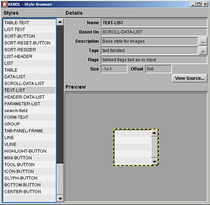
There is currently no style reference. In its place is the style browser, which can be invoked here:
do http://www.hmkdesign.dk/rebol/vid/tools/style-browser.r
Future
The VID Extension Kit and its documentation is very incomplete, and so the work must continue on:
- Making it simpler, more consistent and cleaner
- Making more styles
- Fix a lot of bugs
- Finish documentation
Thanks
Thanks must go to:
Anton Rolls
Brian Hawley
Maxim Olivier-Adlhoch
Carl Sassenrath
For their gracious help and assistance.
